Below are a handful of digital signage, kiosk, and online ordering original projects at UB Campus Dining & Shops. I get Marketing’s approval on look and feel, and I follow any font guidelines and color schemes that they already use for each corresponding unit’s print material when applicable. More information below each project.
One World Café
© 2021-2023
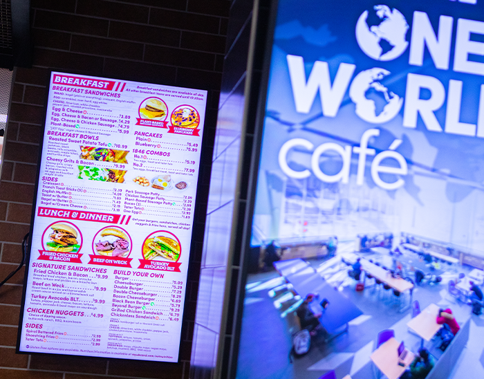
Below is digital signage and kiosk graphic examples at the One World Café, which opened in Spring 2022. OWC is a flashy modern marketplace with multiple international food stations, drinks and snacks. The logos were created by the architecture company who built the space, and I created looks & feels based on those with our Marketing department. Most of the food photos are taken by me, or else they were taken before me or I Photoshopped some things together.
I also had to create a graphics guide. Kiosks, GET mobile ordering, and any other order software we’ll be using in the future should stay consistent, with isolated images and precise angles.
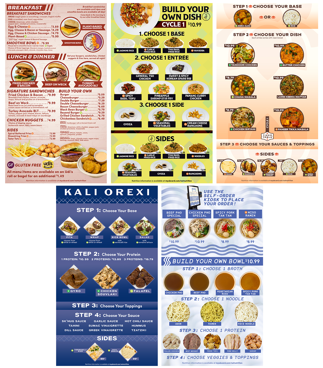
Menuboard examples in Spring 2023
Some OWC kiosk graphic examples. Nextep’s Xenial kiosk dev team did the template, I just gave them the color hex codes, fonts and suggestions. I took all these photos and edited them into these graphics, and created the kiosk’s splash screen. Photo of the splash screen at the right by Dougles Levere in August 2022.
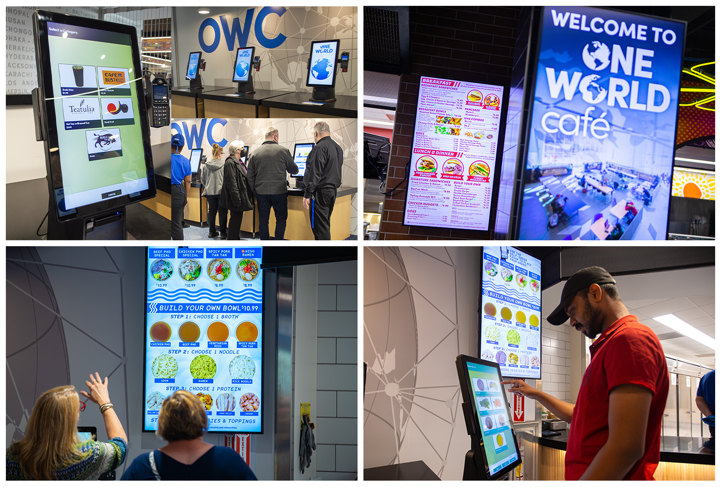
Photos of some of my menuboards and kiosk graphics. Top left self-checkout photos taken by me. Top right, and both bottom photos of menuboards & self-order kiosks taken by Douglas Levere in August 2022.
GET Mobile Ordering
© 2020-2023
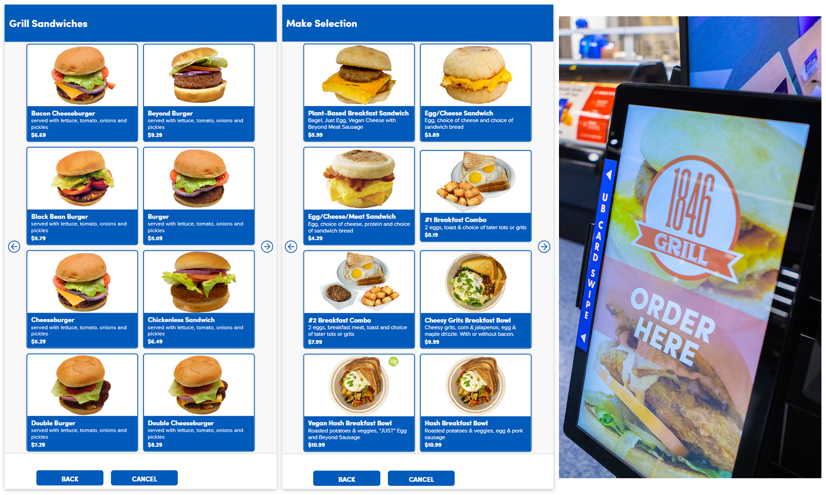
With the pandemic in 2020, we put a lot of our dining units on “GET” mobile ordering software created by CBORD, formerly known as “GET Food.” I didn’t really know much about it when I came back from a 4 month furlough in July 2020, since we just had the IncrediBULL Pizza pickup/delivery on there and I only made a few graphics for that. We’re pretty limited in how everything looks since GET Mobile only lets you change colors, but I wanted to showcase some of the graphics I made. I take most of the photos myself and isolate them from the backgrounds. If I don’t take them, we either had them on hand already from past designers, Marketing took them, or I Photoshopped something together. You can also order through GET on desktop. The way the re-sizing/cropping of graphics thanks to CBORD is a little bit wonky, so that’s why we put “Vt” for Vegetarian, “Vg” for Vegan, etc on the item name rather than the nutrition icon on the graphic itself.

Some of Sizzles GET menu in Spring 2023. Sizzles has been extremely popular on GET since they re-opened in Fall 2020.

Some of Whispers Café at Abbott Hall GET menu in Spring 2023. A new addition to GET for Fall 2022. This is a Proudly Serving Starbucks location, so I was able to just take graphics from the Starbucks site and resize them for GET’s interface.
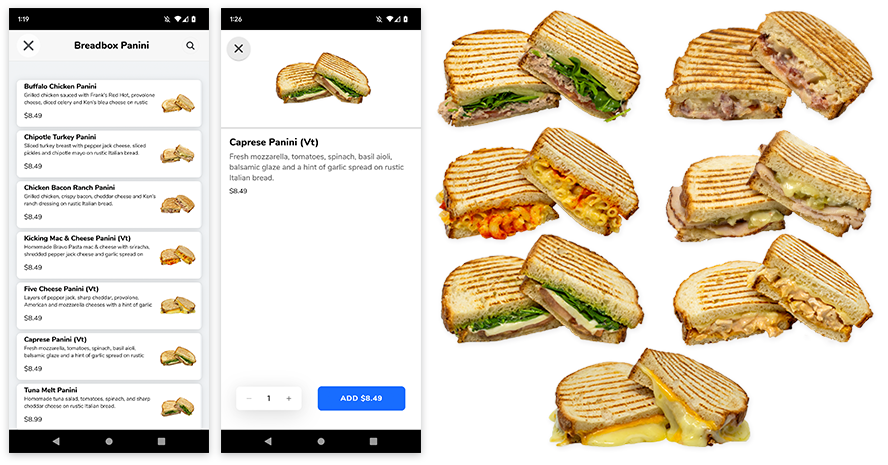
Some of BreadBox at Pistachio’s GET menu in Spring 2023. A new addition to GET for Spring 2023. Bravo Pasta at Pistachio’s is one of the most popular UB CDS dining locations on any of the campuses. So when students returned in Fall 2020, we converted them completely to GET orders only. BreadBox finally was able to return to production as well in Spring 2023, with brand new panini recipes I photographed that you can see here.
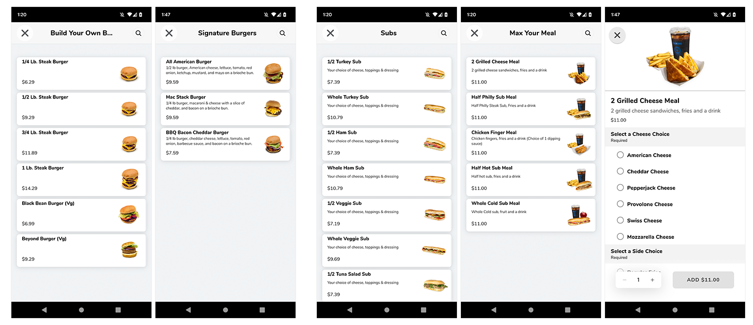
Other example screenshots of other units’ colorful categories on GET full of graphics I created. Some of Stackers BYO Burger menu at Union Market, The Cellar Subs menu & Max Your Meal menu.
Crossroads Culinary Center (C3)
© 2019-2020
Below are all the C3 dining hall’s digital signs during each corresponding time flip explained below. The fifth/right most sign plays ads all day. The fonts and colors are based off of what Marketing usually used for print signage at C3. The dining hall managers have access to input menu items & cycles through a software the devs created and then it gets fed to my signs. The content block that features the menu items is a Web Widget in Rise Vision. I have the devs help me create the CSS and PHP based on my Google web font and color choices.
Click each image to see it in full resolution.
Breakfast
Closed before Dinner. After dinner, the 4th sign would also change to the closed ad on 1-3.
Dinner

Continuous Dining. On weekends, instead of brunch & dinner like Goodyear and Governors, C3 has “continuous dining” which just means they’re open most of the day and bring out each time period’s corresponding menu items throughout the day as they see fit. I still had the managers input their items in Brunch and Dinner like a normal weekend just to decrease confusion for students.
Summer signage. Since C3 is only open for summer groups in the summer and the schedules are sporadic/change often, it’s easier for the managers to still update the items on their end and then students can check online on the Menu page of the myubcard site. Everyone has a smart phone, so it’s best to just tell students to go to the site especially when there’s constant menu item updates.
Goodyear Dining Hall
© 2019-2020
Below are all the Goodyear dining hall’s digital signs during each corresponding time flip explained below. The fonts and colors are based off of what Marketing usually used for print signage at Goodyear. The dining hall managers have access to input menu items & cycles through a software the devs created and then it gets fed to my signs. The content block that features the menu items is a Web Widget in Rise Vision. I have the devs help me create the CSS and PHP based on my Google web font and color choices.
Click each image to see it in full resolution.
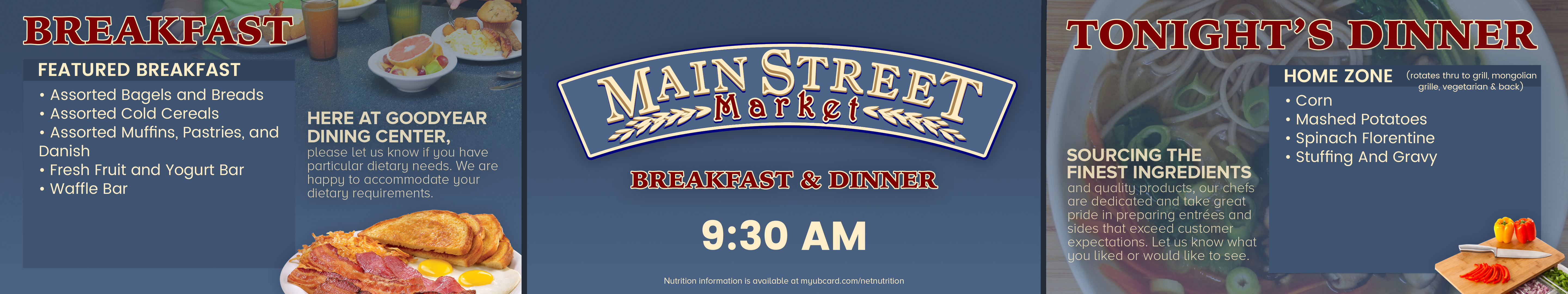
Breakfast. Brunch on the weekends is exactly the same except sign 1 has the Brunch menu instead of Breakfast.

Dinner
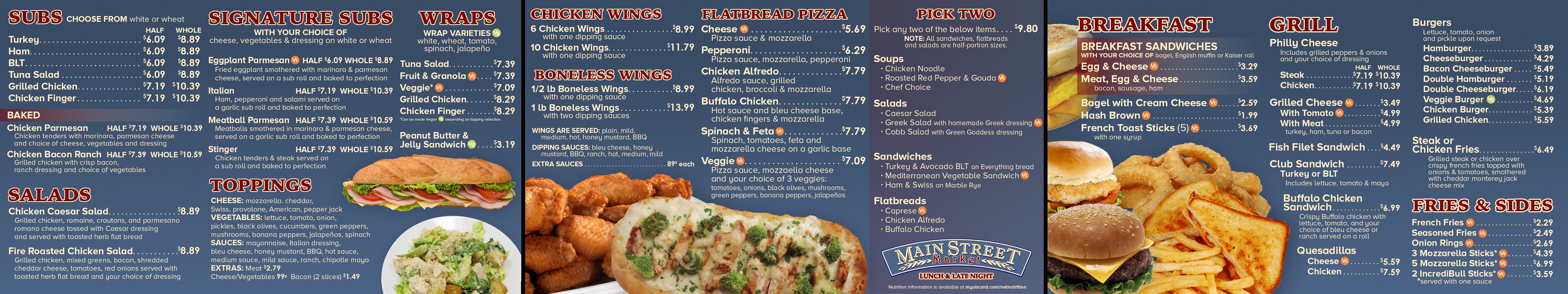
Lunch & Late night. These are static jpgs and don’t have changing menus with a web widget like Brunch/Breakfast/Dinner.
The Cellar pre-2020 Signage
© 2018-2019
In 2019 I was asked to simplify the signage for The Cellar and remove the video effects, but I was really proud of the glow effect in my video graphics. I wanted it to give it that 50’s drive-in feel since that’s what a lot of their print signage was like from 2015-2019. Below is an example of the 4th (of 4) sign that featured their specials.
Miscellaneous Ads
© 2018 I filmed one of our student field techs grabbing a coffee and breakfast sandwich from the convenience store in Ellicott Complex, and then created a video advertisement out of it.