© 2018 UB Campus Dining & Shops
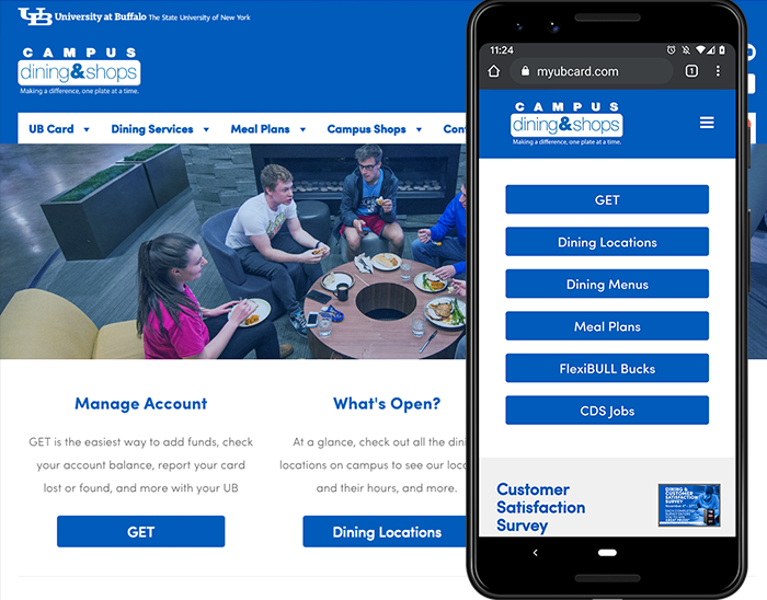
In 2018, I took part in the redesign of myubcard.com. It was already responsive, but we condensed it a lot especially in the top nav. Following the same style as buffalo.edu websites, we placed all the “About” information in the footer and left it out of the top.
I helped make everything a little more minimalistic. Flat, simple design was key here, as well as making sure everything was ADA-Compliant by a certain deadline. I worked closely with the devs to make sure everything was up to spec in terms of color contrast, code and easy readability for screen readers.
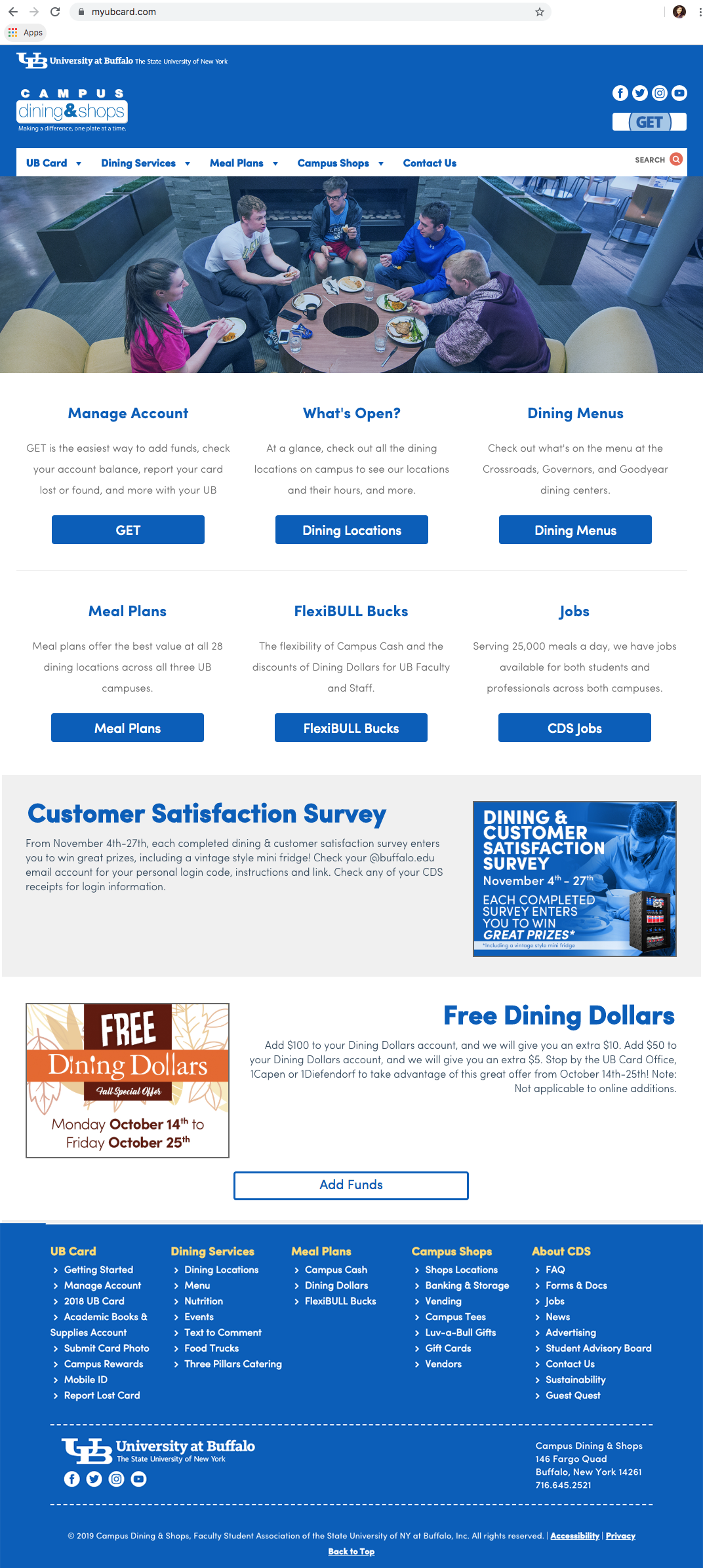
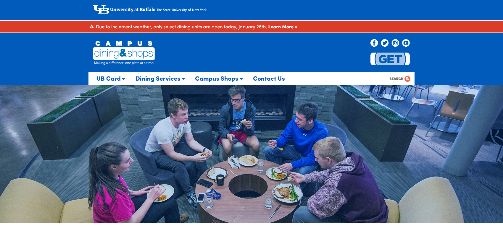
Homepage. Pre-redesign, we had a rotating banner with ads, as well as photos for the featured links. We decided to remove the photos for the featured links, and I made smaller graphics instead of the rotating banner for the ads. This way we can put a blurb with the graphic and it can be read by screen readers.
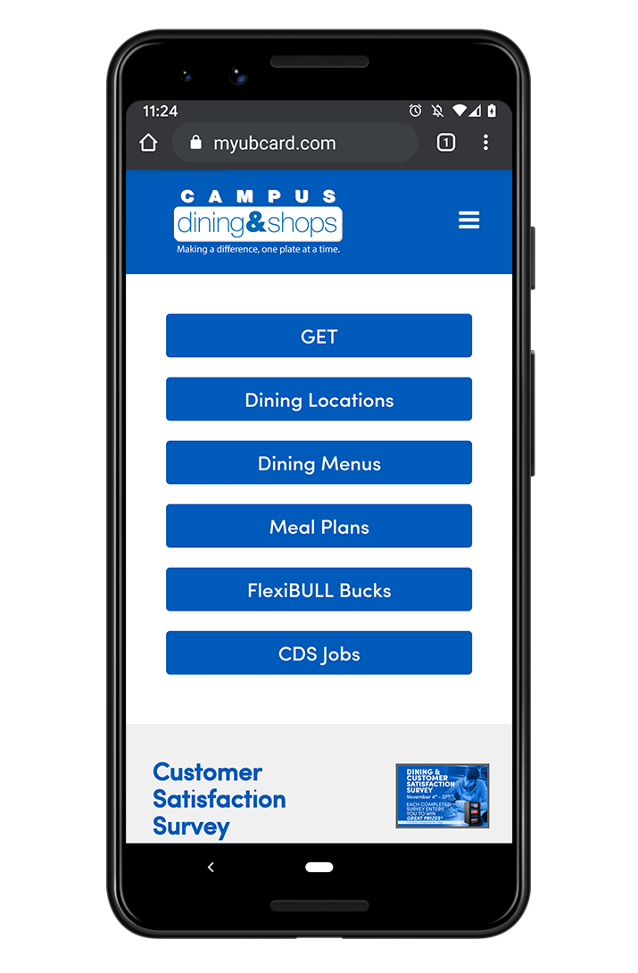
Homepage as how it looks on mobile.
Alert banner – danger

Alert banner – information

Time & Attendance system information page. Because of ADA Compliance, I have to translate all PDFs to HTML for the rest of time.
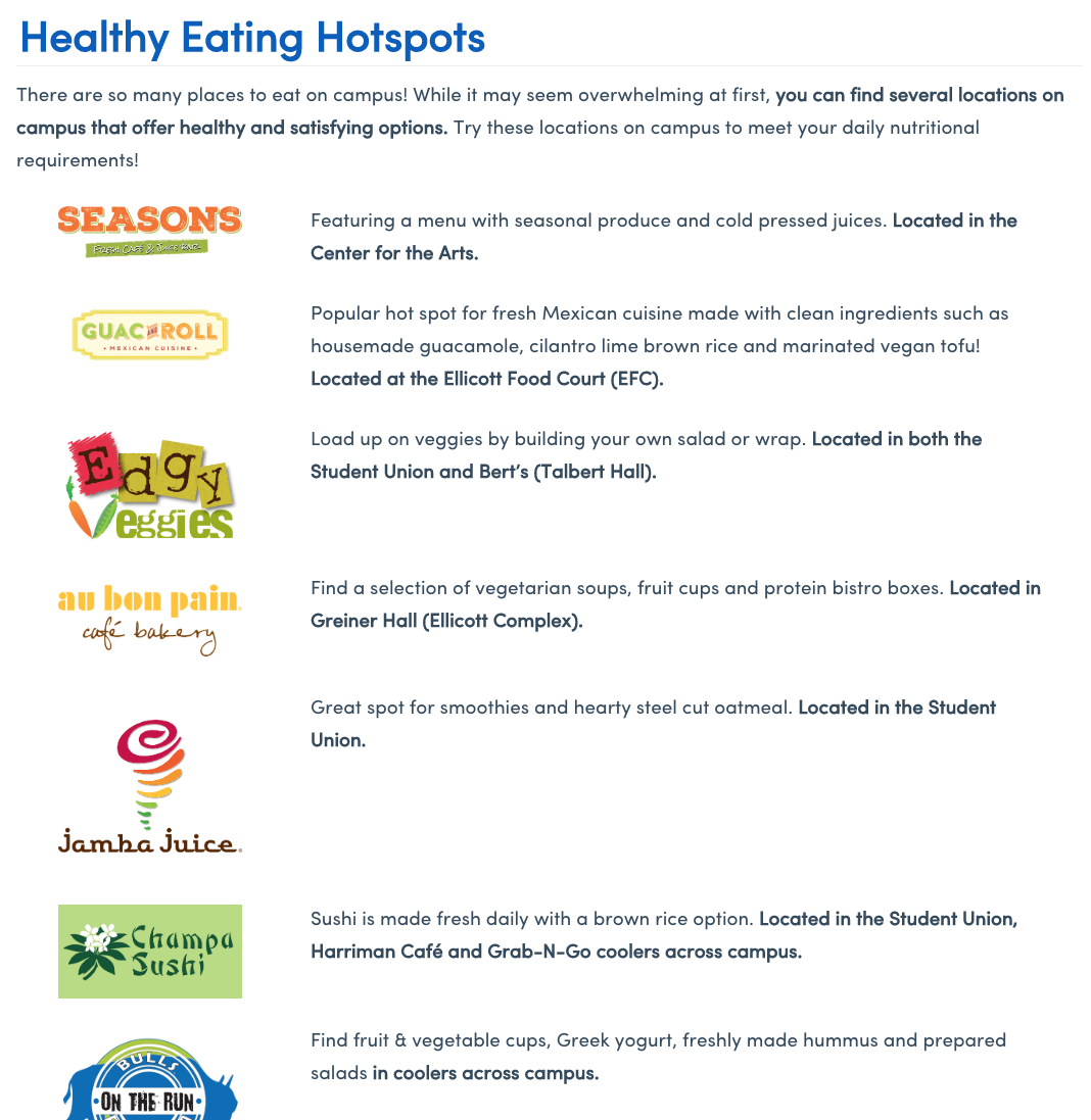
An excerpt of the Nutrition page. Also translated to HTML from a PDF.
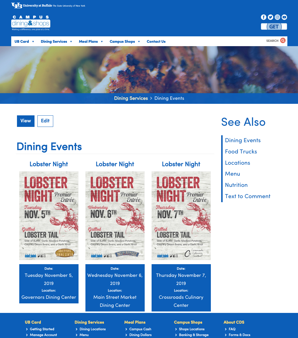
How the Dining Events page looks. We have an Event module that I update every time Marketing finishes up a poster for an event. I make text files of whatever text is in the event poster and that’s what the screen reader will read when it scans over the image. If it’s a big event, they also get a homepage ad graphic. And then I resize their posters to a 1920×1080 digital ad for every event.
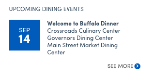
The Dining Event module feed trickles into the See Also right sidebars on every page. This is how it looks. Once you click on “See More” it will take you to the full Dining Events page.
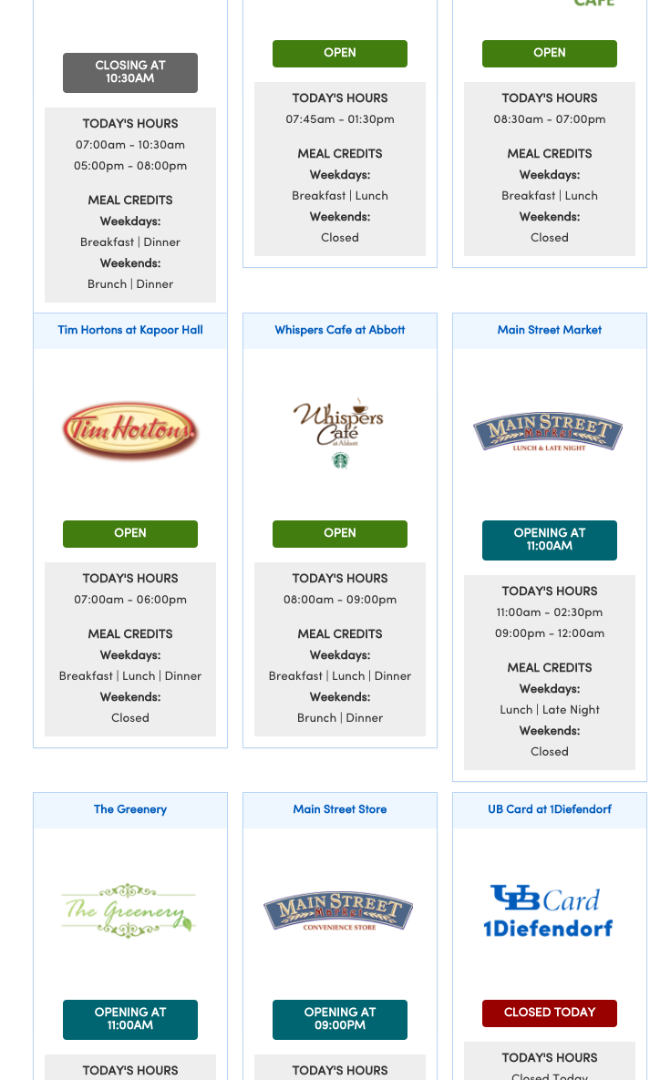
How the Locations page looks. It’s real time but you have to refresh the browser to ping the correct time. We have different ADA approved colors for open, closed, closing and opening soon.
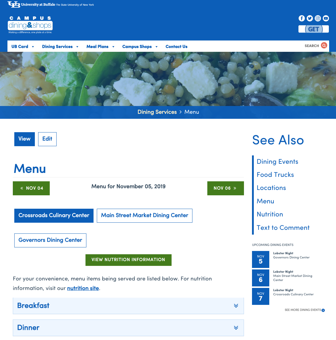
How the top of the Menu page looks. It just features the 3 Dining Hall menus here. Items are listed under accordions (see below).
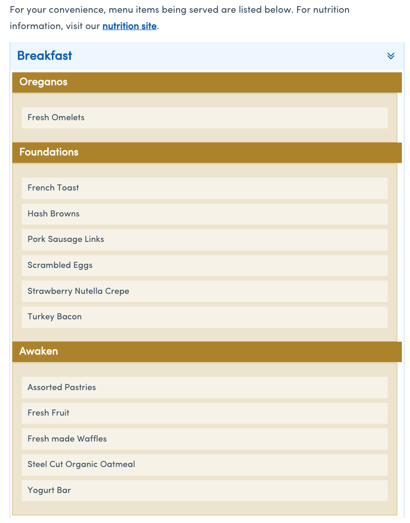
How the items look under the accordions. There’s different ADA approved colors for each time period. The dining hall managers have access to a software that the devs created/maintain and they update the items themselves. Then it gets fed to this page on the site, as well as our digital signs.
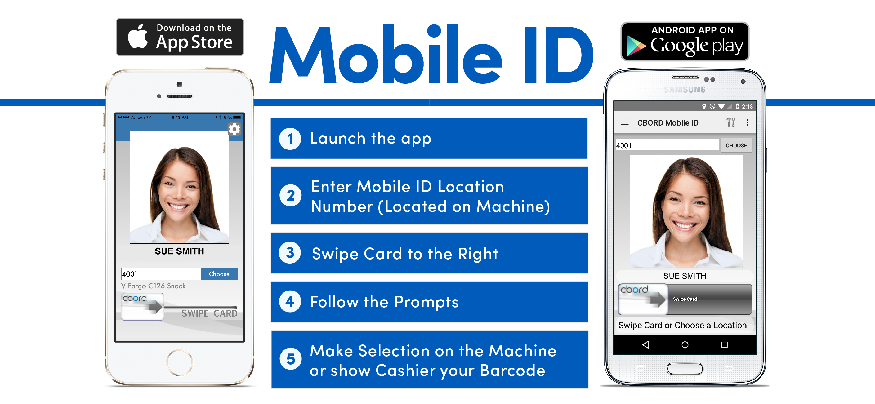
A graphic for the CBORD Mobile ID app that I created for the Mobile ID page on the website.