© 2018 UB Campus Dining & Shops
After 30 years of the same old stale University at Buffalo Card design, I was asked to re-design it. We had to go through many hoops with the University and University Communications for about a year or so.

My preliminary designs. These photos were from the UB SmugMug account so they are from official UB photographers. The bottom right is the UB Bulls logo. Eventually UB Communications agreed to polish the top right option with the wall crest.
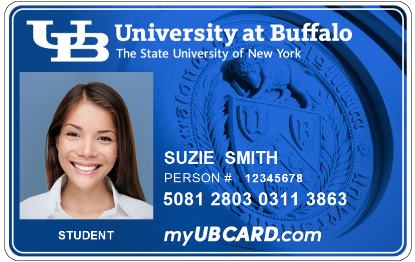
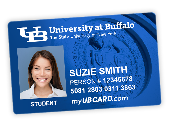
Eventually it came down to the wall crest with a blue hue. SysAdmin and UB Card liked the idea of having the thin white line and outline because sometimes the printer would print off center and with trial & error this seemed to look the best.

Here’s the blurb that we put on our myubcard website about the card change. I made the graphic comparing the old front & back with the new front & back.

We actually decided to forego the white line and outline and just have the image extend out like a bleed. Here’s how that looks printed with the rounded edges.

A graphic I made for the Mobile ID page on the myubcard site, featuring Mobile ID on an iPhone with the new UB Card underneath it.
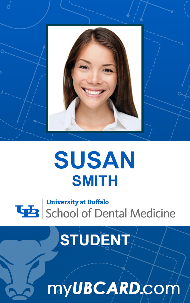
With the new main UB Card finally approved and live, I also was asked to re-design the Dental Medicine vertical nametag in the same style. Printed, it has rounded corners as well, it just is not shown here.